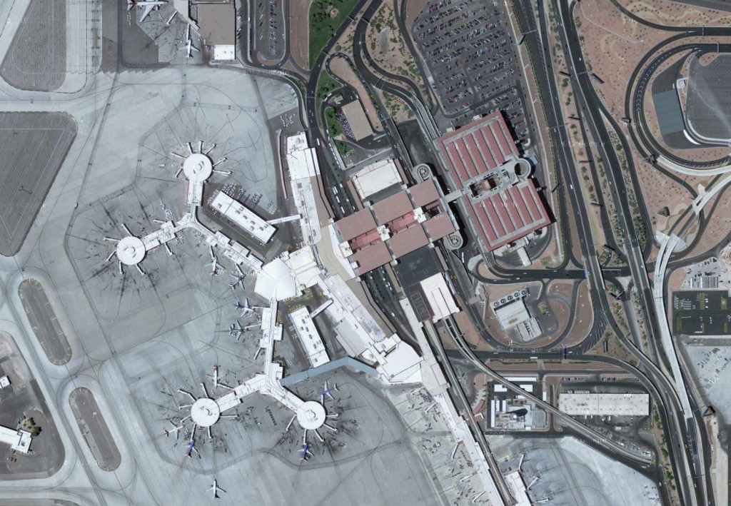
I have written about this in a previous post, but I think Terminal 3's parking garage deserves an official Bad Design Moment post. This is largely due to my sadness regarding the design reoccurring on a recent, unexpected, trip there.
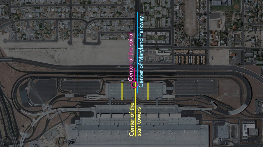
McCarran Airport's new terminal 3 is efficient, but the overall design is mediocre, certainly compared to the original terminal 1 building. The worst part of the new terminal building is the location of the parking garage's spiral ramp that is unsymmetrical within itself as well as missing a perfect opportunity to align with Maryland Parkway. It would have been an easy gesture to simply move the spiral, or the whole structure, to make the spiral align with Maryland Parkway or at the very least center it between the two stair towers. The parking garage s is a real beast and sad considering Vegas has some really well designed parking garages (including the one very near at terminal 1).

Below is a simple diagram illustrating the parking garage's many centers.
Location: Russell Rd and Maryland Pkwy, Las Vegas, NV


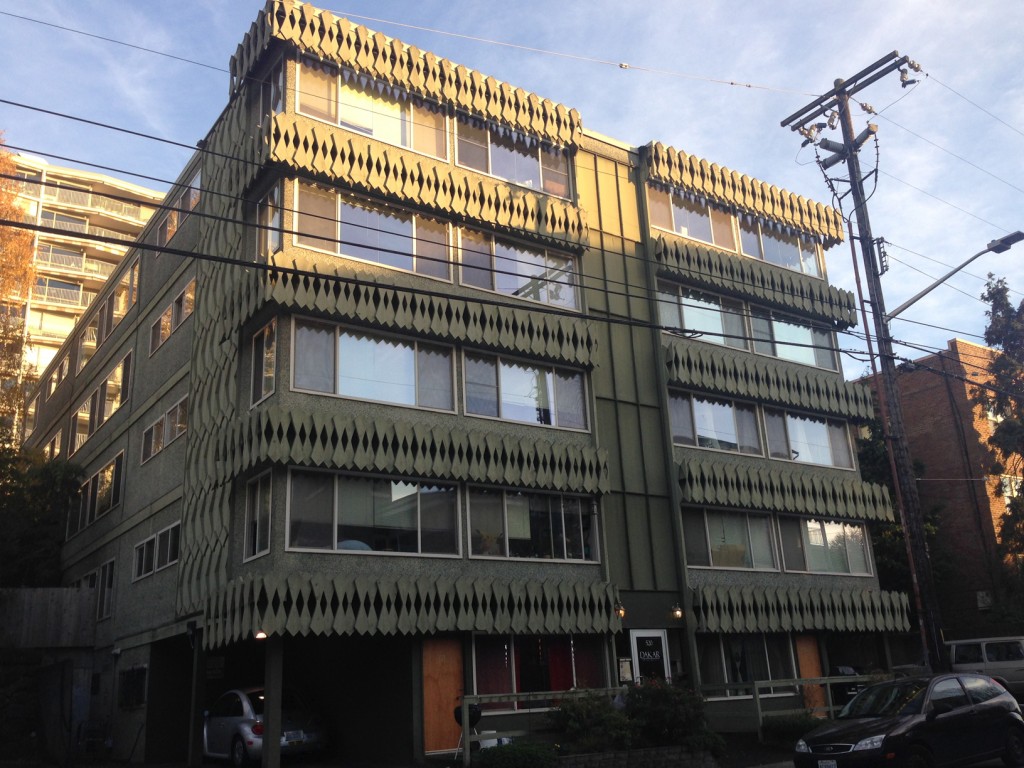
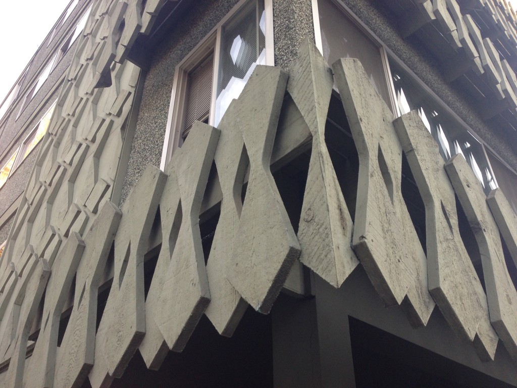


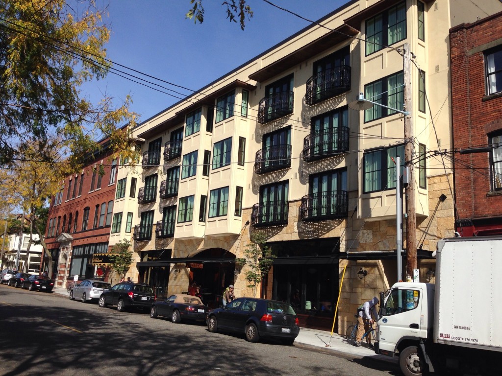 Ballard Avenue's row of old brick and stone buildings have been one upped by the beautifully designed facade of the Ballard Hotel. The designers pulled out all the stops to shows Seattlites the finest detailed faux Tuscan stucco that easily rivals the finest tract developments of Las Vegas, (maybe even surpasses the


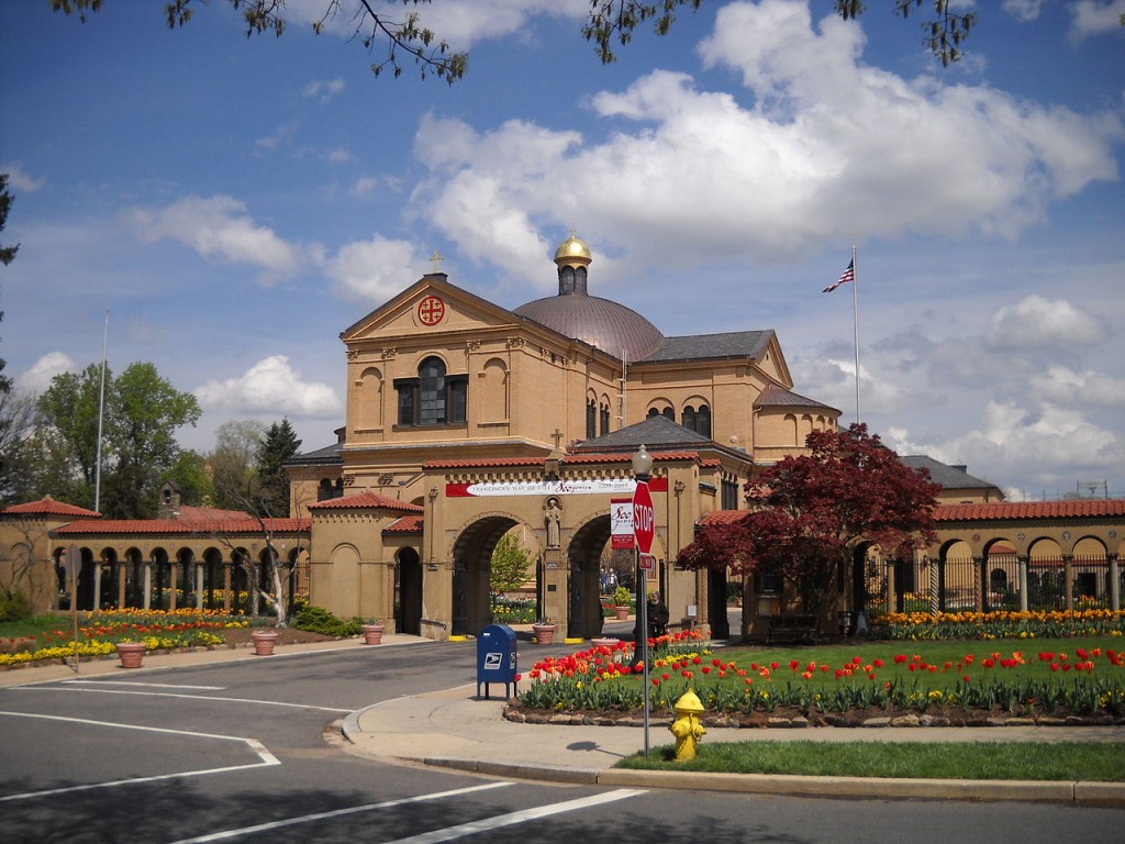 The great weather this weekend motivated me to get out and finally see some architecturally relevant, but less known places around DC. One of the best sites I visited was the Franciscan Monastery tucked away in a residential neighborhood of Northeast DC. The church and cloister are situated on a hill and the cloister opens to the south revealing a small well designed park. This park had everything, including hidden grottos, all being replicas of historical biblical spaces. I found this better than the church itself. This is worth a visit for someone who finds themselves in the area.