Nate Silver's Take on March Madness

Source: New York Times 
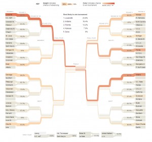
Nate Silver has done it again. Instead of politics, he has put together a prediction bracket for this years NCAA Basketball Tournament.  It'll be interesting to follow, certainly by Monday when the first two rounds are complete.

Let's hope for some upsets.


Interesting Art Project - Bad Zoning

700 Delaware Ave, SWI recently received an article from a friend who thought  this was an art project worth checking out. A former church has become a building sized mural in Southwest DC. This seems like an interesting idea, and one worth checking out, but this speaks more to the bad planning by Washington than the cultural shift of religion. The Southwest portion of DC was used as a grand experiment of city planning in the 50s through 70s. The area is plagued with awful zoning. much of the old existing street grid was tore up for large thoroughfares and freeways. Today the experiment is over and while many great architectural building still remain, there lacks the mixed use needed to bring this area back. If proper zoning took place, this former church/art project could make for a great bar, restaurant, or concert venue.

Las Vegas

So time has passed since my last post. I was putting in extra hours at the office and in early June I went to the homeland for a vacation. I had not been in the valley for almost one and a half years and I was very pleased to see the place was just as I remembered it. First, the weather was beautiful with dry heat and unseasonably cooler temperatures. I sat outside a Starbucks in 90 degrees and thought this is what 90 degrees should feel like. I was happy to see all my friends and family were doing well. When flying in, I realized I forgot about the city's true scale of sprawl. It's amazing from the perspective of someone now living on the east coast to see a world of such low density. I think the sprawl isn't as bad as I thought it was in the past. While there are still negative impacts, certainly on the environment, I think the city for the most part can adapt what they currently have to make the city better through increasing densities in older parts of the city. I'm glad to see a push towards moving into downtown Las Vegas. This part of town is a true gem and I'm sure rents will rise as more people realize this.

I found a few new development since I last lived in the city. I am happy to see the mass transportation system is still expanding and really meeting the needs of the high density routes. I am glad to see the new terminal and signage system for McCarran Airport, although the new airport doesn't seem to be nearly as attractive as the adjacent terminal 1. The pastel colors of the parking garage reminds me more of post modern architecture over something complimentary to the desert landscape and Terminal 1. Additionally, the designers of the parking garage convey a real slapdash placement of the building with the center spiraling ramps being about 20 feet off center of Maryland Parkway.  Every time I sat at the light of Maryland Parkway and Russell Road I cringed at the off centered spiral. It would have been a simple and easy gesture to have the spiral on axis with Maryland Parkway. I would comment on the airport itself, if I could have seen it over the parking garage.

The Lou Ruvo Center for Brain Health was less exciting that I thought it would be. I found the steel structure overwhelming. The main interior space seems like it could offer something good.

I also took a moment to look at Predock's Las Vegas Library also part of the Lied Discovery Children's Museum. I was really surprised at what the library had to offer. One of my favorite features were the outside reading rooms. The small rooms inserted around the exterior of the building offer patron the ability to take books outside without checking them out. A really good courtyard inserted in the center of the building reminded me of the courtyard next to the Cordoba Cathedral where small canals allow water to flow from one tree to the next. Unfortunately, this courtyard looked closed and not well maintained. I recommend a stop for the designers in the valley that haven't been inside since childhood.

I like the development around the center of the strip. My only complaint is the new pedestrian walkways around the Cosmopolitan and City Center are a pain to navigate. The design of the walkways don't address the need for pedestrian to pass by the two casinos, instead making you go into the mall or walking down to street level to only go back up shortly after. Also, could the county finally connect Harmon to a major street on the west side of I-15? This is a great thoroughfare that is underutilized.

All in all, the city is still great. Keep up the good work Las Vegas.

Portfolio

So, it's likely that some of you have browsed over to my web portfolio at some point. I have been working on the html version bit by bit. Understanding the complex language of html these days has been challenging at times, especially when a poorly written script works in Chrome to only be completely wrong in Internet Explorer. Even Chrome can't manage to understand my scripts sometimes. It's not like the good ol' days.... I'm pretty amazed at the power of a cascading style sheet. Anywho, I am going to start producing pages for each of my projects. My first page is for one of my favorite early projects, The Rare Books Library. It's a cool hand draw project from my third year.

I will start working on the other pages and I'd like to get your opinion on future developments. Take a look at the portfolio browser and let me know which projects seem more interesting to you from the single image provided. This will give  me priorities for future development. Also feel free to give me feedback on the portfolio, good and bad.

I Like My Architecture Plaid

We were at a our local bar the other day, when someone noticed a picture in the dimly lit corner of Jesus blessings a building. I jumped up and examined the picture to recognize the building as the United Nations Headquarters. I say "great design," followed by a friend asking "whats so great about a box?" This question comes up often. I don't think Washington solely possesses this architectural pessimism, but Washingtonians have a way of becoming experts on anything with all the Master's Degrees. I know I can't change an international relation's expert on architecture, but I'll beg that one hear me out.

What instills confidence that the UN Headquarters a great building is the fact that Oscar Niemeyer and Le Corbusier designed it. I don't know the in and outs of the building, but I know that these two were/are (Oscar is 104! -[Update- Oscar passed away December 5, 2012]) very competent designers with a record surpassing most architects in the past and now. My confidence in these two architects' designs is similar to the confidence most people have in Apple. I don't know every Apple made device, but I can easily argue every product is good. Apple products are known to work well, be built well, and have an intuitive interface. No one can compare!

So what makes Oscar Niemeyer and Le Corbusier so good? In the word of my graduate studies professor, Robert Livesey, "What is it doing?". Everything Corbusier touched was full of symbolism, strategies, historical references, and arguments that would take hours of Doug Graf  diagrams to explain. Niemeyer even recognized the brilliance of  Corbusier calling him "the master"  and he would use these same devices in his own work.

I know this isn't going to convince anyone outside of architecture that the UN Headquarters is great. What makes any architectural argument weak to a laymen is their understanding of architecture as an aesthetic. Architecture is a language. I can't speak French to a German and expect him to understand much. In a similar way, an hour long presentation analyzing the UN headquarters won't make much sense if you don't understand Chandigarh or Brasilia. If one want to truly discuss the merits of the built environment,  it's imperative to know basic architectural language.

If architecture is only an aesthetic, there isn't much to discuss. I like plaid you like stripes.

Why Apple?

I was looking around for CES news this evening and noticed the live stream of the keynote and decided to watch. Steve Ballmer from Microsoft was the speaker, or was it Ryan Seacrest? I believe I live in a world where it is 100% clear to know how to make a great product.  I also believe it is 100% clear to know how to market a product. Apple has spelled out, in every way, what people want in products, how products should work, and marketing. I am dumbfounded while watching Microsoft, a company that has made 90% of the world's operating systems, struggle to sell products.

I am reminded of Tom Smykowski in the movie Office Space where he declares he is a people person. Maybe Microsoft needs to understand people a little better. I think the problem may lie with the executive boards and engineers that make up most companies. From my experience they view the world from a perspective of their own. They are achievers by generic formula and intelligence. Engineers are needed thinkers, they love to solve technical problems. To them, if it works- problem solved. Business people are motivated, they figure out financial success, usually through tried and tested means. To them, if they are making money- problem solved. What Microsoft and many other companies need is a third perspective. This perspective is one that isn't motivated by money or effectiveness, but by quality and attention to detail. Apple designs beautiful products that work and makes a lot of money. Apple's desire is to control and refine every detail (They also don't bother talking about it until it's time for product release). With these three qualities a product can be desired and admired. To me, this is simple (especially after Steve Job's Memoir), but I am astonished everyday that only a handful of companies in my life get it, and the rest tumble down the road hoping soon, it will pop into gear.

Until Microsoft lets someone with the third perspective make decisions, I think the company will continue to lose market share. This is unfortunate because Windows is something I prefer.


Tate & Snyder in DC?

I was walking down Connecticut Ave when I passed a guy selling books for a dollar, and I was very surprised to see a Las Vegas firm's catalog as part of the collection. I had to buy it. The book illustrates how Tate & Snyder (now Tate Snyder Kimsey) tried to establish an architecture of Las Vegas. It's fun to see your high school, elementary, and other familiar buildings featured in a book bought in DC.

Dupont Circle - CVS - PNC - Baja Fresh Station

So David Alpert reminds us that Metro may be changing some station names to include more stuff around, such as Smithsonian - National Mall  in his article  from Greater Greater Washington. The idea clearly puts  more words in the title of a station. This is ridiculous,  the name needs to be short and descriptive. The purpose of the station name is not to inform one of everything within walking distance of the station, but to let one decipher the difference between stations. It's nice if the station name reflects a geographical location like Dupont Circle, but it's not always necessary as Foggy Bottom means little to me, but I know where the stop is in relation to the rest.

So here is my proposal - all station names should be a maximum of 5 syllables or 3 words.

Everyone's an Expert

I was reading a column by John Kelly entitled "Could D.C.’s Metro stations be prettier? Or do they reflect the city perfectly?" in the Washington Post. The article questioned how well Metro Stations resembled Washington the way that other cities (mostly the spectacular international ones) do. The person he used in the article was a  Mechanical Engineer named Dale to make the case that the stations needed improving.

This article largely reflects the dilemma of design. I don't know the ins and outs of the Metro quite yet, but I do know that the system well designed architecturally. The system is functional, but creates an unconfined and comfortable space. I can't think of many stations, and I have been to quite a few, that aren't cluttered by columns or strike fear in the claustrophobic. Luckily Kelly agrees with me on this point.

One can suggest many reasons for the same design of every station, but the most important is that it makes the system clearer. I bet there are two sets of escalators at each end of the station, and if there is another line running I bet I can visually find it through a perpendicular vault and the audio cues of the trains on that line.  Who knows how many signs and tunnels I would have to go through to do the same in London, or Berlin.

I think dolling up the stations would simply be that. A ficticious application to make the people of the time feel like their station is cool. This would largely follow the culture of now, being grossly outdated within 10 years, if not sooner. Then we would be hearing about how out dated the station is and how it needs to be improved. The Metro stations are classic, not to decorated, and functional. 30 years from now the people will still feel the stations are boring, but that sure beats the ugly that dated architecture cliche quickly becomes.

On a closing note I would just like to say, good design is always taken for granted. The Metro stations have so many brilliant details that people likely don't notice. My favorites are air conditioning that comes from the tall brown information signs and under the concrete benches- or that the majority of the light comes from reflections off the vaults- or that the audio system was originally hidden below the side walls to hide all the clutter of most train systems. I think we should celebrate and embrace maintaining the original design. It has proven successful since the 60s and people should recognize it for that.