As promised there are some really great architectural moments happening around Lexington. I was lucky to have my friend, Jonathan, drive me around and show me some buildings he's taken notice of, as well unexpected stops following my own verbal "ooo, what's that?" These moment's will be part of a mini series called Lexington Modern, which will focus on modern architectural places of the city. I will start with a building that is both, old and new.
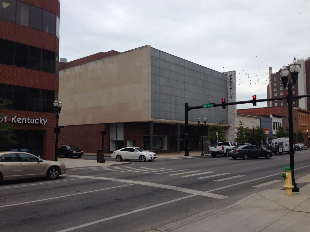
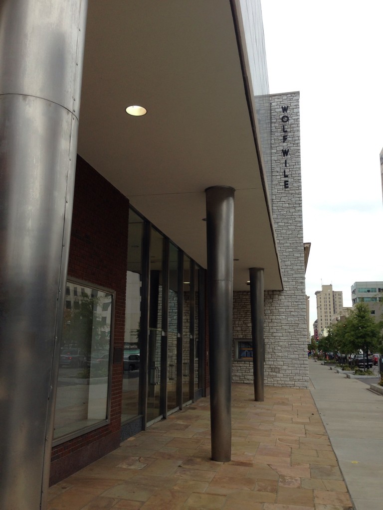
 In 1948, Lexington's Wolf Wile Department Store moved from a location near Union Station, at the time, to a brand new building on the corner of Quality and Main Streets. The building would be architecturally up-to-date and represent the newest in retail trends. The Architects behind the structure were Lexington's Frankel and Curtis (check out some of their other buildings!) and what appears to be a retail consultant, Amos Parrish and Co. The architectural design is a rare type in the region, but all the rage in the late 40s. The owners kept the building in good shape until 1992 when the store closed due to the competition of the ever-so-familiar suburban stores. Luckily, in 1996 the James N. Gray Construction company bought the former store and made it their corporate headquarters. Not too long following the purchase, the building was listed on the National Register of Historic Places.
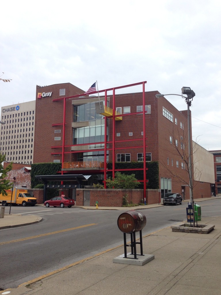
 The building is a great example of mid century modern. I find it very fortunate that both the original and current owners made an effort to preserve the building. Preservation of buildings this old, certainly ones of a modern style are hard to come by. The current owners, Gray, a design-build construction firm, not only took the time to preserve the existing building, Franklin Gray (an Architect) designed a new interior and a contemporary addition to the rear of the building (now used as the entry). This addition is excellent from the exterior and something that I appreciate in the context of Lexington's downtown. It shows how contemporary architecture can fit well within an old urban context.
 The modern addition has familiar theoretical elements after my own quick analysis. The dominant element being the yellow platform that extends past the red steel grid. The platform reminds me of Le Corbusier's ship like element above the front door of Villa Vaucresson (aka Besnus), with the end angled piece similar to the protuding cooridors of La Tourette. The red steel grid could be compared to the facade of Terragni's Casa del Fascio making the argument of capitalism versus fascism. Capitalism, the platform, (with an american flag!) is superior and stable compared to fascism, the red steel grid, looking unorganized, slipping around the rear massing. This could then be compared to the former store itself, a capitalistic enterprise (oddly with Italian details inside) being protected by government regulations but, I digress...
This building is good and one that is luckily protected both by the owner and the government.
Check out Lexington Modern Photo Album for more recent photos and former images of the space used to list the building on the National Register of Historical Places.
Thanks to Peter Brackney for writing a informative piece about this building in 2011 that I used to find out so much about this building.
